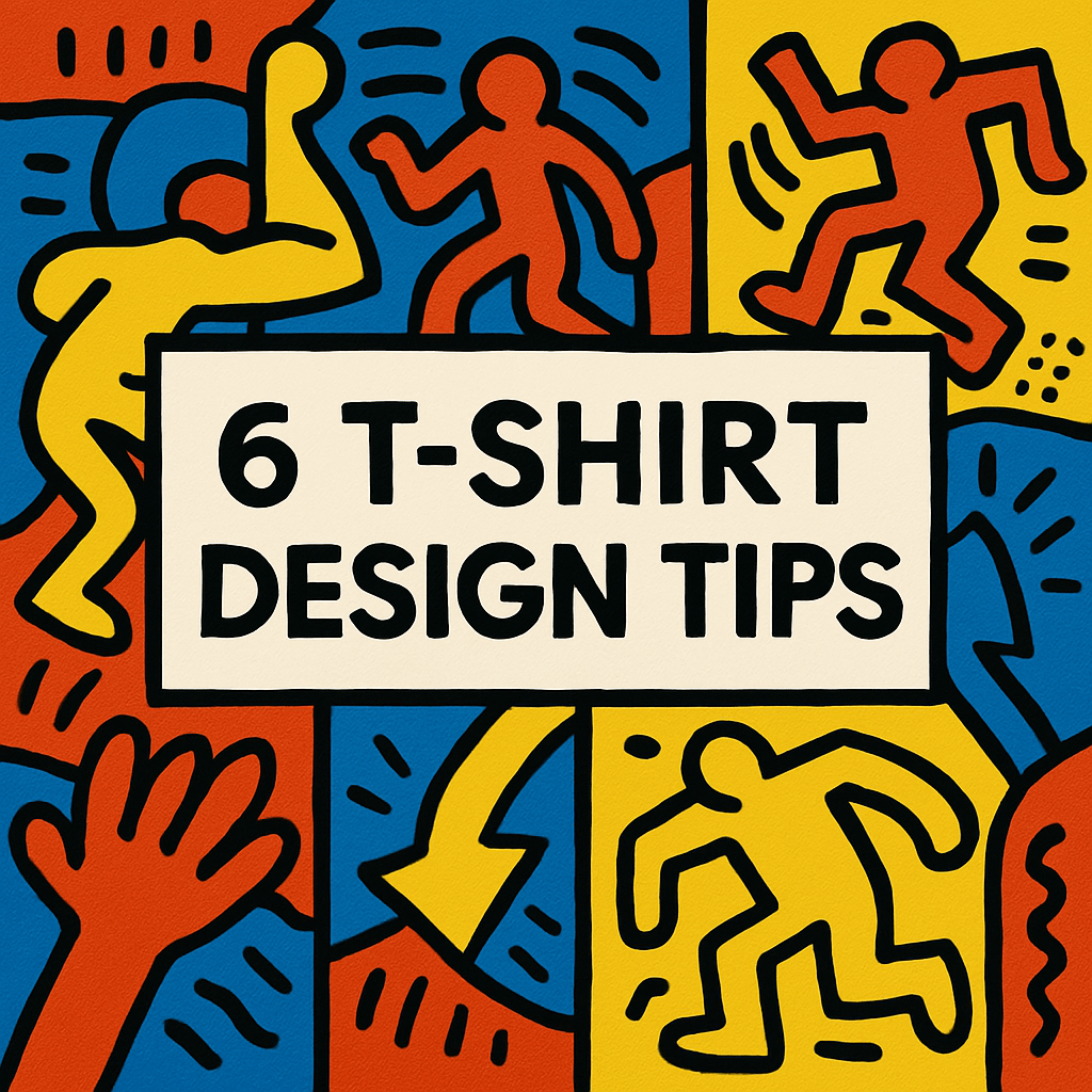
6 T-Shirt Design Tips Every Graphic Designer Should Know
in Design, Inspiration, Knowledgebase on April 11, 2025
Designing a great T-shirt is more than slapping some art on fabric—it’s about combining creativity with practical thinking, emotional resonance, and technical precision. A successful T-shirt design not only captures attention visually but also connects with the person wearing it and those who see it. It has the power to communicate identity, attitude, humor, or purpose in an instant. Whether you’re designing for clients, building a streetwear label, creating promotional apparel, or launching your own indie brand, understanding the broader context in which your design will live is key. Great T-shirt design is about storytelling, functionality, and aesthetics coming together in harmony. From fabric choice and printing method to layout and message, every element matters. Here are six essential tips that will help elevate your T-shirt designs from ordinary to outstanding and ensure they’re not just worn—but loved.
1. Simplicity Sells
While complex illustrations can be stunning, they don’t always translate well on fabric—especially when worn, wrinkled, or viewed from a distance. T-shirts are often seen at a glance, whether someone is walking by or scrolling through an online store, so clarity is absolutely essential. A clean, simple design with a strong focal point not only draws attention quickly but also communicates more effectively. It ensures that the visual message is absorbed instantly and remembered. Think bold shapes that pop, limited color palettes that create contrast, and minimal text that is easy to read at a glance. Simplicity isn’t about being boring—it’s about maximizing impact. In fact, some of the most iconic T-shirt designs in history are memorable precisely because of their simplicity. If your message or artwork isn’t instantly readable or recognizable, you risk losing your audience’s attention before they ever engage with the deeper meaning or creativity behind it. Start simple, refine with purpose, and remember: clarity drives connection.2. Know Your Audience
Understanding who you’re designing for is crucial. Different audiences bring different expectations, styles, and cultural references to the table. A streetwear crowd may lean toward edgy, urban graphics, high-contrast imagery, and bold messaging, while a yoga lifestyle brand might prefer calming, nature-inspired visuals, soft pastels, and minimalistic line art. Meanwhile, a retro-loving audience might appreciate vintage typography and faded colors, while fans of pop culture may gravitate toward clever references and character mashups. Tailor your design to reflect the values, humor, fashion sense, and lifestyle aesthetics of your target audience. This might mean researching current trends, analyzing what successful brands in that niche are doing, or even surveying potential buyers to better understand their preferences. This alignment between design and demographic can make or break a shirt’s success by ensuring the design resonates emotionally and stylistically with the people you want to reach.3. Master Placement & Scale
A great design can fall flat if it’s poorly placed or sized, regardless of how visually strong it is on its own. Center chest is the most common print area for a reason—it’s universally visible and works well across most shirt styles—but don’t limit yourself to just this option. Explore alternatives like oversized prints across the back, subtle branding on the sleeve, or creative placements on the hem or shoulder. These variations can make a shirt stand out and add uniqueness to your design approach.Use mockups to preview how your artwork looks on different T-shirt fits, colors, and sizes. What works beautifully on a slim-fit medium tee might appear awkwardly off-center or too small on an oversized XL or loose tank top. Placement should complement the human form, accentuate the shirt’s cut, and align with the intended mood or message of the design. Scale is just as important—too small and your message gets lost; too big and it can feel overwhelming or disproportionate. Scale and placement should enhance, not hinder, the wearability of the shirt. They can transform a good design into one that looks tailor-made for the garment, appealing to wearers who appreciate both form and function.4. Design With Printing in Mind
Not all designs print equally, and understanding the strengths and limitations of various printing techniques is essential for creating a successful T-shirt. Intricate details, fine lines, and smooth gradients may not translate well with traditional screen printing, which relies on solid, separated color layers and often requires simplification to ensure quality and consistency. On the other hand, full-color, photorealistic artwork may be ideal for DTG (Direct to Garment) or sublimation printing, which allows for more color variation and complexity without sacrificing clarity.Each method has its own unique characteristics—screen printing is cost-effective for bulk runs and offers vibrant, long-lasting colors, but it’s limited by the number of colors you can use affordably. DTG is perfect for on-demand or small-batch printing and allows full-color output, though it may not be as durable or vivid on dark fabrics without pretreatment. Sublimation, which works best on polyester and light-colored garments, is ideal for all-over prints but isn’t compatible with cotton or dark shirts.Always consider the production method before finalizing your design to avoid surprises during the printing process. Talk to your printer if you’re unsure about what’s achievable. Keep your file print-ready by using high-resolution vectors for logos and illustrations or 300 DPI raster graphics for detailed artwork. Convert text to outlines or paths to ensure compatibility and prevent font issues. By planning with the printing process in mind, you’ll produce better-looking shirts and avoid costly revisions or reprints.5. Color is a Strategic Tool
Your choice of color should do more than look good—it should serve the design both functionally and emotionally. Color is a visual language that influences how people feel and interpret a design, and on a T-shirt, it plays a pivotal role in determining overall impact. Make sure there’s enough contrast between your ink and the fabric color so that text and illustrations are easily visible from a distance. A great design loses its power if it fades into the background or becomes unreadable.Whenever possible, use the T-shirt’s color as part of the composition. Incorporating the shirt’s base color into the design itself can help you reduce ink usage, enhance contrast, and tie the artwork naturally into the garment. This approach also allows for clever negative space usage, which can make your design appear more integrated and intentional.Limit the number of ink colors not only to maintain visual clarity but also to keep printing costs manageable—especially with screen printing, where each color requires its own setup. Too many colors can overwhelm a design, making it feel chaotic or overproduced.Finally, test your design on various shirt colors and styles to ensure it remains effective and legible across different options. A design that looks great on a white tee might get lost on navy or black. Create mockups to evaluate how the color combinations affect mood, readability, and overall appeal. Strategic color choices can elevate a design from good to unforgettable.6. Infuse Meaning and Personality
What sets a good T-shirt apart from a great one is the message behind it. Designs with meaning—whether they make people laugh, think, or feel seen—tend to stick in our memory and resonate more deeply with the people who wear and view them. A great T-shirt design doesn’t just decorate the wearer—it expresses identity, communicates a stance, or shares a feeling that words alone often can’t capture.Inject your own personality, beliefs, or commentary into your work, even in subtle ways. The quirks that make you unique as a designer are often the exact elements that make your designs relatable and refreshing. A single graphic element or phrase can carry a story, and when it does, it fosters a more personal connection between your audience and your work.Authenticity connects. Audiences are drawn to designs that feel real, sincere, and unapologetically original. Even abstract or artistic designs can carry emotional weight if they reflect a unique perspective—whether it’s inspired by your cultural background, a moment in your life, or your artistic worldview. In a sea of mass-produced graphics, it’s the T-shirts that tell human stories that truly stand out and spark conversation.Final Thoughts
T-shirt design is both an art and a craft. It requires an understanding of aesthetics, psychology, and production constraints, all working together to deliver something that’s not just visually appealing but emotionally resonant and wearable. By balancing creativity with technical know-how and a strong understanding of your audience, you’ll create designs that not only look good but get worn again and again, becoming part of someone’s everyday life or even their identity.It’s not just about designing a cool graphic—it’s about evoking a feeling, inspiring a reaction, or sharing a message in a way that feels natural and authentic. The most cherished T-shirts often become conversation starters or comfort items, and your work has the potential to hold that same kind of power. Keep experimenting, stay inspired by the world around you, challenge yourself to push beyond trends, and let each tee tell a story worth sharing—because that story might just be exactly what someone else needed to see or wear.Recent Blog Post


Categories
- Design (25)
- Inspiration (5)
- Knowledgebase (2)
- News (3)
- Uncategorized (7)
Subscribe
Most of the time, we share our discount coupons to our Newsletter Subscribers only. And get products updates also!
You Can Unsubscribe Anytime